
Detection Flow Chart
The Detection flow chart shows an overview of how many emails Microsoft decided to let through to the end users (delivered to Inbox/Junk folder) and how Avanan classified these emails.
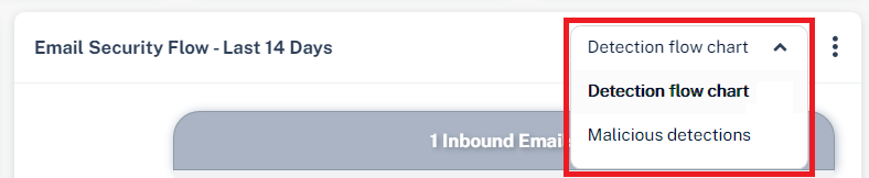
To view the chart, go to Overview page and in the Avanan Flow widget, select Detection flow chart from the drop-down in the top-right corner.
-
The numbers in the chart may seem inconsistent with the numbers you see in other parts of the dashboard as the chart represents emails and not security events.
-
To view the emails filtered per selection, click on the relevant section. You will be redirected to the Mail Explorer page and it shows the relevant emails.
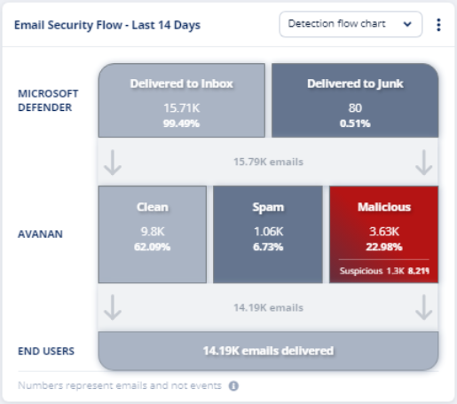
Row name |
Email classification |
Description |
|---|---|---|
|
Microsoft Defender |
Delivered to Inbox |
Emails Microsoft intended to deliver to the inbox. |
Delivered to Junk |
Emails Microsoft intended to deliver to the Junk folder. | |
|
Avanan |
Clean |
Emails detected as Clean by Avanan. |
Spam |
Emails detected as Spam by Avanan. | |
| Malicious | Emails detected as Phishing and/or Malware by Avanan. | |
| Suspicious | Emails detected as Suspected Phishing and/or Suspected Malware by Avanan. | |
End Users |
- |
Number of emails delivered to the end users. |